Block styles — Layout, Background & Width
Every block in the block editor has a Style panel near the top of its settings sidebar — just below the Spacing controls and above the block's own content fields (Title, Subtitle, and so on). It controls three things: Layout, Background, and Width. Changes here auto-save along with the rest of the block, the same way content edits do.
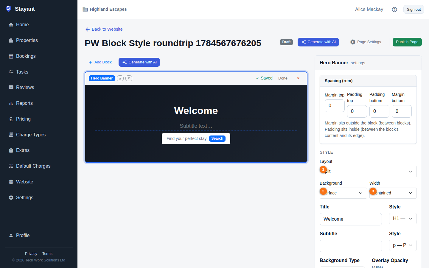
Layout ①
Layout changes the block's overall structure — how its content is arranged, not just its colours. The choices are different for every block type, and only blocks that offer more than one layout show the dropdown at all (a block with only one layout skips straight to Background/Width).
The Hero Banner block has the most choices — five layouts:
| Layout | What it looks like |
|---|---|
| Classic | Full-bleed background image, centered text (the default) |
| Left aligned | Full-bleed background, left-aligned text with a narrower measure |
| Split | Solid surface background, text on the left and the image on the right in a rounded frame |
| Card | Background image with a frosted content card holding the text |
| Minimal | No image — oversized type on a surface band with an accent kicker |
| Collage | Text beside a grid of three photos — your main photo plus two more |
| Framed | Your photo inset in a thick frame, with the text over it |
Other blocks with more than one layout:
| Block | Layouts |
|---|---|
| Feature List | Classic, Scrapbook, Numbered (big step numbers), Image cards, Amenities strip (a row of icon chips that scrolls sideways on phones) |
| Image + Text | Classic, Overlap, Framed, Photo stack (two overlapping photos) |
| CTA Banner | Classic, Gradient, Split (text left, buttons right), Boxed (a rounded panel on a light band), Photo (a photo behind the banner) |
| Property Grid | Grid, Showcase (two large cards per row), Carousel (one row that scrolls sideways), List (photo left, details right) |
| Image Gallery | Grid, Masonry, Filmstrip, Mosaic (one large photo with four smaller ones) |
| Reviews and Testimonials | Card grid, Carousel, Spotlight (one large quote at a time, swipe for the next), Minimal (no cards, fine lines between quotes). Both blocks use the same design |
| FAQ Accordion | Accordion, Two column |
| Map / Location | Full width, Split (address and directions beside the map) |
| Availability Search | Inline, Floating (a raised card that overlaps the bottom of the section above; put it right after a Hero), Bar (one slim row) |
| Contact Form | Centred, Split (your contact details beside the form) |
| Divider | Line, Ornament, Dots, Wave, Space |
To try layouts quickly, click the shuffle button (Try another layout) in the block's toolbar.
Which blocks use Background and Width
Background and Width take effect on every block type.
Background ②
Sets the section's background treatment, independent of layout:
- None — no background; the block sits directly on the page background (the default).
- Surface — your theme's card/surface colour, useful for visually separating a block from its neighbours.
- Tint — a subtle tinted background using your brand colour.
- Brand — your full primary brand colour as a solid background.
- Gradient — a soft fade from a light tint of your brand colour into the page background.
- Photo — a photo behind the section, with white text. Paste the photo's web address and choose how much to Darken it (light, medium or strong) so the text stays readable.
- Dark — a fixed dark band, for a high-contrast section. Use it sparingly: your site is light-only, and the AI builder doesn't use it. Brand or Tint usually looks better.
Width ③
Controls how wide the block's content measures against the page:
- Contained — the standard content width used across the rest of your site (the default).
- Narrow — a tighter, more readable measure — good for text-heavy blocks like FAQ Accordion.
- Full — stretches the block's content edge-to-edge.
More style options
Open More style options under Width for finer control. Every option has a theme setting, so you only change the ones you need:
| Option | What it does |
|---|---|
| Kicker | A small uppercase label above the section title, such as The cottages or Getting here. |
| Title size | Makes this section's title one step smaller or larger than your theme's. |
| Title alignment | Puts the title on the left or in the centre, whatever the block normally does. |
| Space above / Space below | None, small, medium or large spacing for this section only. |
| Photo shape | Crops the block's photos to square, landscape, portrait or wide. |
| Photo focus | Where the important part of the photo is (0–100% across and down), so cropping keeps it in view. |
| Animation | Fade or slide this section in as visitors scroll, or turn it off. It only works when Motion is turned on in your site design. |
| Show on | Show the section on all devices, desktop only, or phones only. |
| Anchor | A short name, such as cottages, so a link or button pointing to /#cottages jumps straight to this section. |
| Show from / Show until | Show a seasonal section only between two dates. Outside those dates it's hidden on your live site. Preview still shows it, with a note. |
Reset to theme clears every one of these options and keeps your chosen layout.
More options for this block
Some blocks also have a More options for this block section below the Style panel. It holds settings that only make sense for that block:
- Hero Banner:
- height (short, medium or full screen);
- photo darkening (even, or a gradient that keeps the top of the photo bright);
- a second button;
- two extra photos for the Collage layout;
- a scroll-down arrow.
- Image + Text:
- a second photo for the Photo stack layout;
- an icon list: one line per item, written as
icon | text; - a stats row: one line per stat, written as
number | label, for example45 | acres; - where the text sits beside the photo;
- whether the photo comes first on phones.
- Property Grid:
- how many properties to show (up to 24);
- whether to show the "from £X / night" price;
- type filters, which appear when there are more than six properties.
- Image Gallery: how many photos to show before a View all button. Visitors can click any photo to open it full screen and step through the rest.
- CTA Banner: the photo and its darkening for the Photo layout.
- Reviews: whether to show the rating summary, and a length after which long reviews get a Read more link.
- FAQ Accordion: a search box (shown once there are six or more questions), and structured data that helps Google show your questions. See FAQ and Map.
- Map / Location: show a map picture first and load Google Maps only when a guest taps Show map.
- Contact Form: the text shown beside the form in the Split layout.
- Columns: the space between columns, and whether columns of different heights line up at the top, middle or bottom.
- Divider: full width or short (centred).
Icons. In a Feature List or an Image + Text icon list, type an amenity name instead of an emoji to get a matching icon in your theme's colour. You can use:
- Stay and comfort:
sauna,hot-tub,pool,log-burner,fire-pit,bbq,bath,quiet,home,tv,kitchen,breakfast,laundry,wifi,parking,ev-charging. - Pets and families:
dogs,pets,animals,family,accessible,games. - Outdoors and location:
walking,bikes,beach,garden,woodland,views,stargazing,location. - General:
check,star.
Property cards show a Dogs welcome or Accessible badge only when your own amenities text for that property says so.
Blocks inside Columns
A block nested inside a Columns block doesn't get its own Style panel or Spacing controls — only top-level blocks on the page do, whether you select the nested block on the page or inside the Columns block's settings. Its background and layout follow the parent Columns block's own settings instead.
It's optional
None of this is required — leave everything on its defaults (Classic layout, no background, contained width) and your blocks look exactly as they did before the Style panel existed. Use it when you want a section to stand out, read differently, or match a particular part of your page design.