Block styles — Layout, Background & Width
Every block in the block editor has a Style panel near the top of its settings sidebar — just below the Spacing controls and above the block's own content fields (Title, Subtitle, and so on). It controls three things: Layout, Background, and Width. Changes here auto-save along with the rest of the block, the same way content edits do.
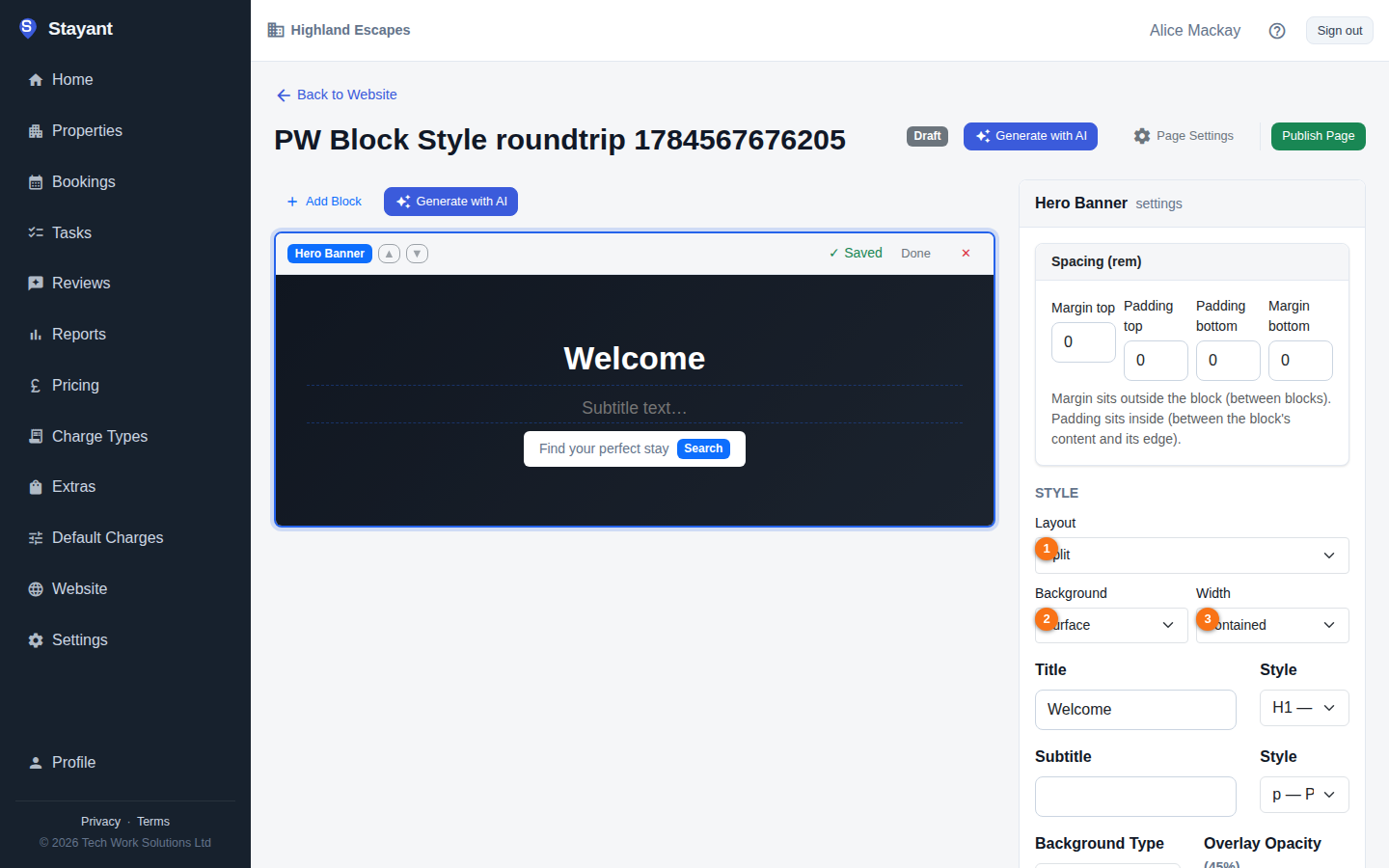
Layout ①
Layout changes the block's overall structure — how its content is arranged, not just its colours. The choices are different for every block type, and only blocks that offer more than one layout show the dropdown at all (a block with only one layout skips straight to Background/Width).
The Hero Banner block has the most choices — five layouts:
| Layout | What it looks like |
|---|---|
| Classic | Full-bleed background image, centered text (the default) |
| Left aligned | Full-bleed background, left-aligned text with a narrower measure |
| Split | Solid surface background, text on the left and the image on the right in a rounded frame |
| Card | Background image with a frosted content card holding the text |
| Minimal | No image — oversized type on a surface band with an accent kicker |
Other blocks with multiple layouts include Feature List (Classic, Scrapbook), Testimonials (Card grid, Spotlight, Minimal), Image + Text (Classic, Overlap, Framed), CTA Banner (Classic, Gradient, Split, Boxed), Property Grid (Grid, Showcase), FAQ Accordion (Accordion, Two column), and Image Gallery (Grid, Masonry, Filmstrip).
Which blocks use Background and Width
Background and Width currently take effect on your site for these blocks only: Hero Banner, Feature List, Testimonials / Reviews, Image + Text, CTA Banner, Property Grid, FAQ Accordion, and Image Gallery. The Style panel also appears on other blocks (such as Rich Text, Image, or Map), but changing Background or Width there has no visible effect on the published page.
Background ②
Sets the section's background treatment, independent of layout:
- None — no background; the block sits directly on the page background (the default).
- Surface — your theme's card/surface colour, useful for visually separating a block from its neighbours.
- Tint — a subtle tinted background using your brand colour.
- Brand — your full primary brand colour as a solid background.
- Dark — a dark band regardless of whether the rest of your site is in light or dark mode — handy for a high-contrast section.
Width ③
Controls how wide the block's content measures against the page:
- Contained — the standard content width used across the rest of your site (the default).
- Narrow — a tighter, more readable measure — good for text-heavy blocks like FAQ Accordion.
- Full — stretches the block's content edge-to-edge.
Blocks inside Columns
A block nested inside a Columns block doesn't get its own Style panel or Spacing controls — only top-level blocks on the page do, whether you select the nested block on the page or inside the Columns block's settings. Its background and layout follow the parent Columns block's own settings instead.
It's optional
None of this is required — leave everything on its defaults (Classic layout, no background, contained width) and your blocks look exactly as they did before the Style panel existed. Use it when you want a section to stand out, read differently, or match a particular part of your page design.