Site design
The Design card on the Website Settings page (/website/settings) controls the overall look of your whole public site — every page you build, plus the guest booking flow. It works top-down: pick a preset to set everything at once, then fine-tune from there. Nothing here is required — leave it untouched and your site keeps its classic look.
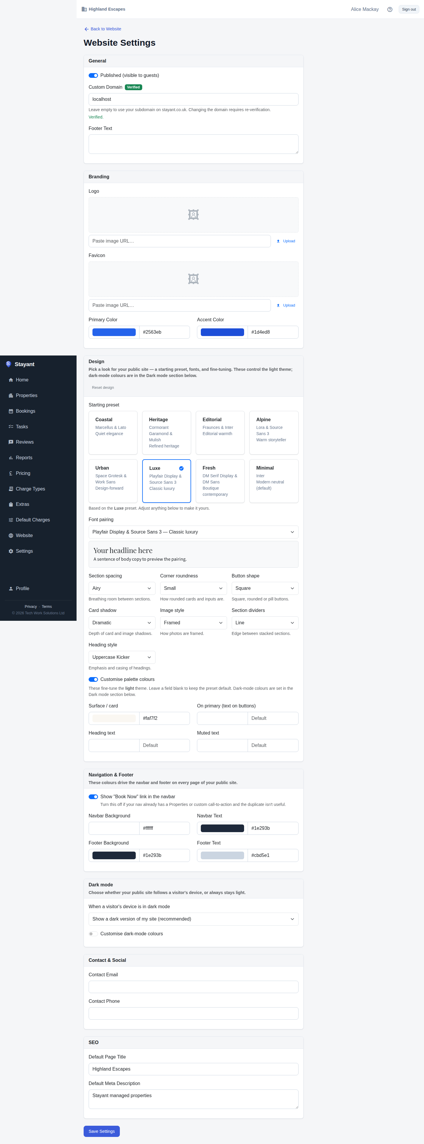
Everything on this card themes the light theme. Dark-mode colours are set separately in the Dark mode card lower down the page — see Dark mode.
Start from a preset
The Starting preset gallery is the fastest way to a finished look. Each preset is a curated combination of a font pairing and design tokens — for example Editorial (warm serif headings), Luxe (classic luxury), Coastal, Heritage, Urban, Alpine, Fresh, or Minimal. Click a card to apply it; the selected preset is highlighted with a tick. Picking a preset is just a starting point — every setting below stays editable, so you can take a preset and make it yours.
Choose a font pairing
The Font pairing dropdown sets the heading and body typefaces for the whole site. Each option pairs a display face for headings with a readable body face (for example Playfair Display & Source Sans 3 or Fraunces & Inter). The live sample directly below the dropdown previews the exact fonts so you can compare pairings without leaving the page.
Tune the design tokens
Below the fonts are the design tokens — small, site-wide dials that change how everything is shaped and spaced:
- Section spacing — the breathing room between page sections (Compact / Regular / Airy).
- Corner roundness — how rounded cards and inputs are (None → Large).
- Button shape — Square, Rounded, or Pill buttons.
- Card shadow — the depth of card and image shadows (None → Dramatic).
- Image style — how photos are framed (square, rounded, framed, or soft shadow).
- Section dividers — the edge treatment between stacked sections.
- Heading style — the emphasis and casing of headings.
Each change updates the tokens the public site reads, so they apply everywhere consistently.
Fine-tune palette colours (optional)
Turn on Customise palette colours to override a few individual light-theme colours — surface, text-on-primary, heading, and muted-text. Leave any field blank to keep the preset's default. These affect the light theme only; dark-mode colours live in the Dark mode card.
Reset design
The Reset design button in the card header returns the whole site to the classic default look — no preset, default fonts and tokens, and no palette overrides. Use it to start over.
Save and preview
The Design card shares the single Save Settings button at the bottom of the page. After saving, open your public site (it must be published) to see the theme applied — the heading font, spacing, roundness, and shadows all reflect your choices.