Pages & the block editor
Every page on your booking site is built from a stack of blocks — sections like a hero banner, a property grid, an image gallery, or a contact form. You arrange and style them in the block editor.
Opening the editor
From the Website page, click Edit Blocks on any page in the pages table. This opens the editor at /website/pages/<page id>, showing the page's blocks down the left as a live canvas with a settings sidebar on the right.
The header shows the page's Published / Draft status and gives you View (opens the live page when published), Preview (see Preview a page), AI assistant (on plans that include it), Page Settings, and a Publish Page / Unpublish toggle.
Adding a block
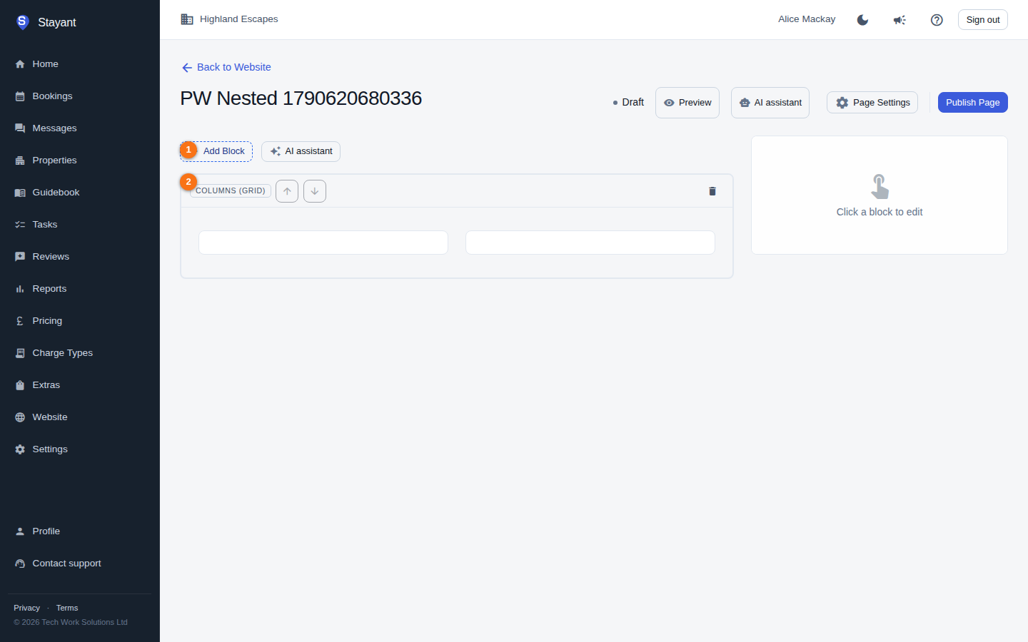
Click Add Block (①) above the canvas, choose a Block Type from the dropdown, and click Add Block. The new block is appended to the bottom of the page (in the canvas, ②) with sensible default content you can then edit.
Editing a block
Click any block on the canvas to select it (①). When active it shows an inline editor on the canvas, and its full settings open in the right-hand sidebar (②). Edits auto-save — you'll see "Saving…" then "✓ Saved" in the block's toolbar (there's no separate save button). There's no draft copy of a published page: if the page is published (on a published site), each edit is live for guests as soon as it saves. To rework a live page privately, unpublish it first. Click Done to deselect, or the bin icon in the toolbar to delete the block (you'll be asked to confirm).
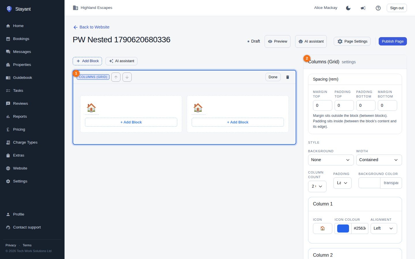
Each top-level block's sidebar also exposes spacing controls (top/bottom padding and margin) so you can fine-tune the gaps around it. Blocks nested inside a Columns block use the Columns block's spacing.
Reordering blocks
Use the up and down arrow buttons in a block's toolbar to move it up or down the page. The arrows are disabled at the top and bottom of the stack.
Block types available
When you add a block you can choose from:
- Hero Banner — a large headline/subtitle section with a background image, slideshow, or video, a call-to-action button, and an optional availability date picker.
- Rich Text — a formatted text block with alignment.
- Image Gallery — a grid of images (configurable column count).
- Property Grid — cards for your properties; show all or pick specific ones.
- Contact Form — an enquiry form guests use to message you; each message is emailed to you and listed under Messages → Website enquiries. See The Contact Form block.
- Feature List — a list of feature/benefit items with optional card styling.
- Divider — a horizontal separator.
- Columns (Grid) — a multi-column layout; each column can hold its own nested blocks (Rich Text, Feature List, Image Gallery, Contact Form, Divider, or Image).
- Image — a single image with alignment, sizing, borders, and visual adjustments (scale, rotation, brightness, contrast, etc.).
- Availability Search — a search box for guests to check dates and find a stay.
- Testimonials / Reviews — manually entered guest quotes with optional ratings, in a grid layout.
- CTA Banner — a call-to-action band with a headline, text, and up to two buttons.
- FAQ Accordion — expandable question-and-answer items.
- Map / Location — an embedded map with an address and optional directions link.
- Reviews (live) — pulls your real, published guest reviews (optionally for one property).
- Rooms (per-property) — lists the rooms for a chosen property.
- Image + Text — a side-by-side image and text section with an optional button.
Testimonials vs. Reviews (live): Testimonials are quotes you type in by hand; Reviews (live) show your actual collected reviews. Pick the live block if you want the section to stay current automatically.
Opening links in a new tab
Buttons and links you add to a block normally open in the same tab, so the visitor leaves your site. If a link points somewhere else — a partner's booking page, a menu PDF, your social profile — you can have it open in a new tab instead, keeping your site open behind it.
Tick Open in a new tab under the link you want it to apply to:
- Feature List — the switch is Open links in a new tab, above the Items list, and it applies to every item's button in that block. There's no per-item setting: a feature list is a set of matching cards, so its buttons all behave the same way.
- Hero Banner — under CTA Button Link.
- Image + Text — under Call-to-action link.
- CTA Banner — one switch under each of the primary and secondary links, so the two buttons can differ.
- Map / Location — under Directions URL. This one is on by default, since directions have always opened in a new tab.
Everything else is off by default, so existing pages keep working exactly as they do now. Links that open in a new tab are also announced to screen-reader users as "(opens in a new tab)".
Tip: leave internal links (your own properties, contact, or about pages) opening in the same tab. Visitors expect to stay in one tab while browsing a single site, and a pile of new tabs is a common complaint.
Editing blocks inside Columns
When you select a nested block inside a Columns block, the sidebar header shows the path (for example "Columns (Grid) › Image") and edits the nested block's content directly. Nested blocks have no Spacing or Style controls of their own — those belong to the parent Columns block, so select the Columns block itself to change them. Changes still auto-save through the parent Columns block.
Letting AI do the work
There are two AI entry points, and neither is a per-page "generate a draft" button:
- The AI Website Builder at
/website/aidrafts a whole site — several pages at once — from a short description of your business. See Generate a site with AI. - The AI assistant in the editor header edits the page you're on, conversationally: add a block, rewrite a section, change the theme. See The AI assistant.
New pages AI creates are drafts — review and edit the blocks, then publish when you're happy. AI edits to a page that's already published, and to the site theme, go live straight away (see What goes live, and when).
Page settings
Click Page Settings in the editor header to edit the page's Title, Slug, Meta Title / Meta Description (SEO), and to toggle Published and Set as home page. The slug can't be changed for the home page (it's always served at /).